Fashion & Beauty
Wedding Party Color Palette: How to Build Yours from Scratch
Your wedding party palette is the first and most sustained visual statement your wedding makes — present in every photograph from the processional to the last dance. Here is the step-by-step framework for choosing it with intention.
Choose your wedding party palette by anchoring first to your gown's undertone and venue, ordering swatches before committing to any color, applying the 60-30-10 rule across bridesmaids and groomsmen, and testing how the palette performs in your venue's actual light. The goal is visual harmony, not uniformity — and the palette you build thoughtfully is the one that photographs beautifully for decades.
Before a single guest sees your centerpieces or hears your first dance song, they see your wedding party walking down the aisle. That visual — the coordinated palette of twelve people moving through your ceremony space — is the frame within which every photograph of your day will be taken. It appears in hundreds of images, from the processional to the last dance. It either anchors your vision or quietly undermines it.
Most couples approach this decision the way they approach a shopping trip: browse until something feels right, then buy. The couples whose wedding photographs they most admire — whose party looks genuinely cohesive rather than accidentally coordinated — approached it the way a thoughtful designer would: by establishing a logic before choosing a specific color, then using swatches, venue light, and a clear coordination framework to confirm the choice before committing.
What is the right starting point for building a wedding party color palette?
The starting point is not a color. It is three anchors: your gown's undertone, your venue's dominant palette, and your wedding season. According to Destination I Do's 2026 wedding color trend analysis, the most visually cohesive wedding palettes are always built outward from the bride's gown, not selected in parallel to it.
Ivory-warm gowns — the majority of the market — harmonize most naturally with warm-undertone bridesmaid colors: dusty rose, sage, champagne, warm terracotta, and deep burgundy. Bright-white gowns with cool undertones work better against cool-toned palettes: dusty blue, slate, soft lilac, and icy champagne. An ivory-warm bride in dusty blue bridesmaids will look visually disconnected from her own party in photographs — not dramatically so, but perceptibly so to a trained eye, and to every vendor you work with going forward.
The venue's dominant colors are the second anchor. A ballroom full of warm gold and dark wood will absorb cool blues and greys; the same ballroom will make burgundy and emerald sing. A garden full of blush roses and white florals will make sage and champagne feel like an extension of the landscape; deep jewel tones in the same space will feel imported rather than grown there.
| Strategy | Description | Best For | Key Requirement |
|---|---|---|---|
| Monochromatic | All bridesmaids in one hue, varied shades or fabrics | Clean, modern, or luxe aesthetic; indoor venues | All pieces ordered from the same dye lot |
| Mix-and-match | Same color, each bridesmaid chooses her silhouette | Parties with diverse body types; bohemian aesthetic | Exact color anchor — same SKU from same brand |
| Tonal gradient | Multiple shades of the same hue family (e.g., blush to mauve to wine) | Large parties; romantic, garden aesthetic | Strict palette boundaries — "shades of pink" is too vague |
| Complementary accent | Neutral ground with one bold accent (e.g., ivory + deep navy) | Any venue; high photography ROI | Strong neutral that reads as neutral across all skin tones |
How do you test a palette before committing?
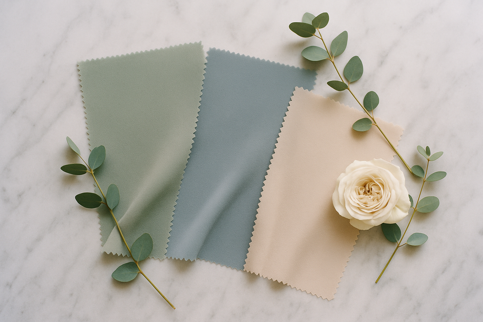
The physical swatch test is the only tool that reliably prevents color surprises at the order stage. Every major bridesmaid retailer — Azazie, Birdy Grey, Kennedy Blue, and Jenny Yoo among them — offers physical swatch kits, typically $5 to $15 and credited toward your purchase. Order swatches for your top two or three color candidates at least five to six months before the wedding.
When the swatches arrive, test them in three specific conditions. First, hold each swatch against your gown fabric in natural daylight — not indoor fluorescent light — and confirm the undertone harmony. Second, photograph each swatch against the dominant wall color or linen fabric of your venue, or bring them to a venue tour. Third, photograph each swatch held at the jaw line of your most diverse-toned bridesmaids. Colors that read identically as chips in hand diverge on living bodies: champagne that photographs as warm and luminous on a fair complexion can read as beige-gold on a medium-warm complexion. The swatch test tells you what you are actually buying.
Mr. Tux's coordination guide adds a step that most couples overlook: the "sun test." Take your swatches outside at the same time of day as your ceremony. Dusty sage indoors can turn olive-green in harsh afternoon light. A color that photographs beautifully at the golden hour may read muddy in the direct midday sun of your outdoor ceremony. This thirty-minute test prevents some of the most common palette disappointments.
How do you coordinate groomsmen, flower girls, and ring bearers into the palette?
Groomsmen coordination begins with a principle: the goal is harmony, not matching. Groomsmen in a sage-colored suit look costumed next to bridesmaids in sage dresses. Groomsmen in a neutral grey or navy suit with a sage pocket square look like part of a unified visual story. The Black Tux's coordination guide recommends carrying the bridesmaid color through one groomsmen accessory — the tie, the pocket square, or the boutonniere — as the simplest and most reliable technique for visual unity across the party.
Suit color choice by venue formality: charcoal or navy for ballroom and estate venues; medium grey or warm tan for garden, vineyard, and outdoor ceremonies; linen in ivory, warm grey, or sage for beach and destination weddings. For 2026, made-to-measure suit brands including Indochino and SuitSupply offer full suits in the $400–$700 range with four to six week turnarounds — the "buy, don't rent" trend continues to grow among grooms who want a suit they will actually wear again.
For flower girls: the fastest technique for visual connection is a wide satin sash in the bridesmaid color on an ivory or white flower girl dress. This avoids the miniaturized-bride look while creating an immediate visual link to the party's palette. Order the flower girl dress one to two sizes larger than her current size to account for growth between the order date and the wedding day. For ring bearers, the groom's tie or pocket square color repeated in a miniature version — same boutonniere, same tie family — is reliably charming and photographically consistent.
According to Le Elite Bridal's Spring 2026 trend report, the most popular party coordination story of the current season is a neutral-dominant palette — dusty blue, sage, or champagne bridesmaid dresses — with one bold accent carried through the groomsmen's boutonnieres and florals. This approach is versatile across every venue type and photographs cleanly under both natural and artificial light. It is also the direction that holds up best in photographs taken twenty years from now: a palette with clear logic and honest scale never looks dated.
Frequently asked
How many colors should a wedding party palette include?
Most bridal stylists recommend three to five colors for a well-balanced wedding party palette, following a structure sometimes called the 60-30-10 rule: one dominant color (60% of visual weight — usually the bridesmaid dress color), one secondary color (30% — often the groomsmen's tie, pocket square, or boutonniere), and one accent (10% — a metallic, a floral accent color, or a contrasting detail). Four to five colors work beautifully when they are tonal variations of the same hue family — three shades of dusty blue and two neutrals create cohesion and depth. More than five distinct colors without a clear organizing principle tends to read as accidental rather than intentional in photographs. The cleaner the palette logic, the more composed and thoughtful the final imagery.
What are the most popular wedding party colors for 2026?
Blue has emerged as the dominant bridesmaid color direction for 2026, with sky blue as the single most requested shade — a crisp, clear blue that photographs beautifully in both natural and candlelit settings. Sage and emerald green remain highly popular for couples who want a nature-forward palette that translates well across all venue types and seasons. Dusty rose and champagne are consistent performers as neutral-adjacent anchors, particularly for spring and summer weddings. Among bolder directions, mocha and warm earthy neutrals — latte, taupe, and terracotta — are gaining significant market share for fall weddings. For couples seeking drama, deep burgundy, mulberry, and jewel tones continue to dominate fall and winter bookings. According to Le Elite Bridal's Spring 2026 trend report, cobalt blue and pistachio green are the season's breakout combination for spring weddings.
How do you coordinate groomsmen attire with bridesmaid dress colors?
The goal of groomsmen coordination is harmony, not matching — the groomsmen should feel visually connected to the bridesmaids without wearing a costume version of their dresses. The most effective technique is to carry the bridesmaid color through one groomsmen accessory: the tie, the pocket square, or the boutonniere. A sage bridesmaid dress paired with a grey suit and a sage pocket square creates instant visual cohesion in photographs without requiring anyone to dress identically. Suit color choice is determined by venue formality: navy or charcoal for ballrooms; grey or tan for garden and daytime ceremonies; warm khaki or linen for outdoor summer and destination weddings. The Black Tux's coordination guide recommends grey suits as the most flexible choice because they read as neutral against nearly every palette and allow the bridesmaid color to lead.
Should bridesmaid dress swatches always be tested in person before ordering?
Yes — this is non-negotiable, and every major bridesmaid dress retailer makes it easy. Azazie, Birdy Grey, Jenny Yoo, Kennedy Blue, and Revelry all offer physical swatch kits, typically priced between $5 and $15 and often credited toward your purchase. Order swatches in your top two or three color options at least five months before the wedding. View them in three conditions: against your gown fabric in person, against your venue's dominant wall or linen color, and against a range of skin tones — photograph each swatch held at the jaw of your most diverse-toned bridesmaids to confirm the color reads as intended on living skin. Screen color is not fabric color. 'Dusty blue' from one brand and 'dusty blue' from another can differ by a full visual step when placed side by side. The swatch test is the only way to know what you are actually buying.
What palette choices work best for fall and winter weddings?
Fall and winter wedding palettes benefit from depth, saturation, and fabrics that read as warm and luxurious under candlelight and low-temperature natural light. The strongest fall performers in 2026 are deep sage or dark olive in velvet, warm terracotta in liquid satin, burgundy and mulberry in any mid-weight fabric, and chocolate brown as a primary — not accent — color. For winter weddings, emerald green and deep navy in velvet or crepe are the most photographically striking choices. Champagne and warm ivory work across both seasons when executed with rich textural contrast in the linens and florals. Sheer or bare-chiffon fabrics that work beautifully in June become visually cold and logistically uncomfortable in November — fabric choice is not merely aesthetic; it is practical comfort for people who will be wearing these dresses for eight to ten hours.
How do you unify a bridal party when members have very different skin tones and body types?
Mix-and-match silhouettes within a single color are the most proven solution for parties with diverse body types. Allowing each bridesmaid to choose the cut that flatters her — A-line, wrap, cowl-neck, or column — while maintaining the same color and fabric family produces visual cohesion without requiring any individual to wear an unflattering silhouette. For skin tone diversity, the swatch test across your full party is essential. Champagne, warm ivory, and dusty nude are the colors most likely to wash out fair skin or be absorbed by deep skin tones — these are not universally unflattering, but they require more swatching before committing. The colors with the broadest cross-tone flattery in Zola's 2025 bridesmaid dress guide: sage green, dusty blue, warm coral, and burgundy. When in doubt, bring a representative sample of your bridesmaids' coloring to the bridal salon and test under the boutique lighting before placing any order.