Flowers & Décor
Seasonal Wedding Color Palettes: 8 Beautiful Combinations by Season for 2026
Your season is one of the most powerful design constraints you have — it determines what flowers are naturally available, what light your photos will be bathed in, and which colors feel authentic to the moment. Here are eight seasonal wedding color palettes for 2026 with real florist guidance, trend context, and honest tradeoffs.
2026 trendsSeasonal bloomsCost impactFlorist guidanceLight characterTimeless vs. trend
The quick verdict
The most beautiful wedding color palettes for 2026, organized by season — with trend grounding, natural bloom alignment, cost impact, and the honest tradeoffs of each combination.
- Best overall
- Dusty Lilac + Butter Yellow + White (Spring) — The breakout spring palette of 2026, endorsed by multiple forecasters including Daisy Sage and Paperlust, this combination works across every level of formality, photographs beautifully in spring's diffuse natural light, aligns perfectly with peak-season blooms (sweet peas, ranunculus, garden roses), and has the rare quality of feeling both fresh and timeless simultaneously. It is neither so trend-dependent that it will date quickly nor so safe that it reads as generic. The butter yellow accent in particular gives the palette an unexpected warmth that separates it from the blush-and-sage combinations that have defined the previous three years.
- Best value
- Terracotta + Sage + Cream (Summer/Fall) — Now in its fifth consecutive year as a trending palette, terracotta and sage has proven its staying power, which means florists have refined their ability to execute it and seasonal bloom pairings are well established. Zinnias, dahlias, marigolds, and garden roses are all cost-efficient in the summer through early fall growing season and align naturally with the palette's warm earth tones. Couples in this palette consistently report lower floral costs than comparable jewel-tone or monochromatic white schemes because the dominant colors align with what is naturally, cheaply abundant.
- Best for Formal evening wedding in a ballroom, estate, or cathedral — high formality, candlelit setting, black-tie or formal-optional guest attire
- Midnight Navy + Champagne + Gold (Winter) — Midnight navy and champagne with gold metallic accents is the single most photographically powerful palette for formal evening weddings. Navy deepens beautifully in candlelight; champagne linens and ivory florals glow against it; gold flatware and hardware elevate the composition to something genuinely grand. It reads as grown-up, intentional, and memorable. It is also one of the most inclusive palettes across different skin tones and guest attire — navy is flattering on everyone and does not clash with the widest range of guest dress colors.
How we evaluated
These eight seasonal palettes were selected and evaluated through cross-referencing 2026 trend forecasts from The Knot, Paperlust, Daisy Sage, Flourish Flower Farm, and WeddingDecor.com; the research dossier on wedding color palettes and seasonal florals; Pantone's 2025 and 2026 color direction; and current florist booking data reflecting which palettes couples are actually requesting. Each palette was evaluated on 2026 trend relevance, timeless staying power, seasonal bloom alignment, cost efficiency, and photographic performance across different lighting conditions.
- 2026 trend relevance. Is this palette actively endorsed by 2026 forecasters and being requested by couples this year?
- Timeless staying power. Will this palette's photographs feel as beautiful in 2036 as in 2026, or does it carry a strong temporal fingerprint?
- Seasonal bloom alignment. Does this palette align with flowers naturally in season during the target season, keeping floral costs reasonable?
- Cost efficiency. Does this palette require expensive imported or out-of-season blooms, or can it be achieved with seasonally abundant, cost-efficient flowers?
- Photographic performance. How does this palette photograph in the typical lighting conditions of its target season — outdoor, indoor, candlelit, golden hour?
Rating scale: Items are rated 1–5 across 2026 Trend Relevance, Timeless Power, Bloom Alignment, Cost Efficiency, and Photography Performance.
Last verified .
At a glance
| # | Name | Rating | Best for | Pricing |
|---|---|---|---|---|
| 1 | Dusty Lilac + Butter Yellow + White | 4.9 | Spring weddings (March through May); outdoor ceremonies in gardens, greenhouses, and country estates; couples who want something genuinely fresh in 2026 without straying into risky territory | Cost-efficient |
| 2 | Soft Blush + Sage Green + Champagne | 4.6 | Spring weddings at any formality level; brides who want maximum photographic safety and universal visual flattery; couples who prefer timeless over trend-forward | Cost-efficient |
| 3 | Terracotta + Peach + Warm Cream | 4.7 | Summer outdoor weddings, vineyard receptions, and garden ceremonies; golden hour photography is particularly transformative for this palette; couples who want warmth, romance, and floral abundance within budget | Cost-efficient |
| 4 | Hot Pink + Bright Coral + Ivory | 4.3 | Summer outdoor weddings, outdoor receptions, beach or coastal venues; couples who want memorable, high-energy celebrations over classic elegance | Moderate cost |
| 5 | Deep Plum + Burgundy + Rose Gold | 4.8 | Fall weddings (September through November) at estates, barns, vineyards, and historic venues; evening ceremonies and receptions where candlelight will enhance the jewel tones; couples who want something unmistakably autumnal without defaulting to orange and yellow | Cost-efficient |
| 6 | Mocha Mousse + Warm Ivory + Copper | 4.5 | Fall and late-summer weddings at refined indoor venues, estates, and historic spaces; couples who want warmth and quiet luxury rather than dramatic jewel-tone statements | Moderate cost |
| 7 | Midnight Navy + Champagne + Gold | 4.8 | Formal and black-tie winter weddings; ballroom, estate, and historic venue receptions; evening-only or nighttime celebrations where candlelight defines the atmosphere | Higher cost |
| 8 | Dusty Periwinkle + Soft Lilac + Silver | 4.4 | Winter weddings for couples who want something distinctly different from the traditional warm palette; evening receptions in intimate venues where silver and candlelight create a reflective, immersive atmosphere | Moderate to higher cost |
Dusty Lilac + Butter Yellow + White
The breakout spring palette of 2026 — soft, luminous, and genuinely unexpected
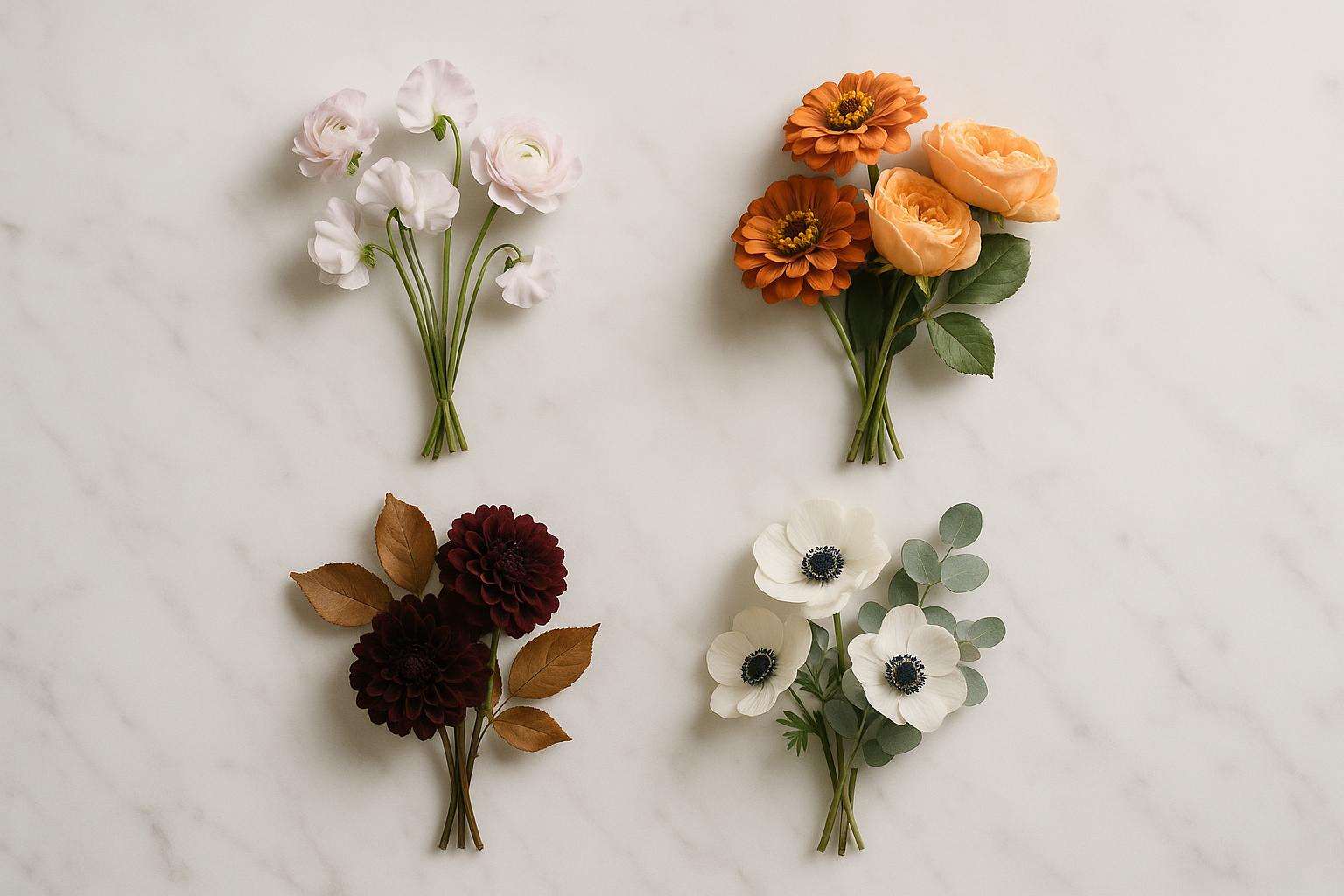
Dusty lilac and butter yellow is the single most-endorsed new spring palette combination in 2026 forecasts, appearing in Daisy Sage's spring trend report, Paperlust's seasonal forecasts, and multiple bridal editorial features as the color story that has most surprised and delighted designers this year. It works because of an unexpected truth: yellow and purple are complementary colors on the color wheel, which means they create visual vibrancy when placed together rather than competition — the lilac cools the warmth of the butter yellow; the yellow warms the ethereal quality of the lilac. The white anchor keeps both from becoming overwhelming. In practice, this palette translates to: ivory or white ceremony linens as the dominant foundation; dusty lilac in bridesmaid attire, florals, and ribbon details; butter yellow as an accent color in the florals (ranunculus and tulips are naturally available in this tone in spring) and in stationery elements; white as a consistent through-line that allows both colors to breathe. Spring's diffuse, bright light — neither the harshness of peak summer nor the golden warmth of fall — is the ideal photographic condition for this palette: pastels register cleanly and with saturation in diffuse spring light, avoiding the washed-out quality they can have in harsh direct sun. Peak seasonal blooms that align perfectly: sweet peas (lilac and white), ranunculus (butter yellow and blush), garden roses (cream and soft pink), anemones (white with dark centers), and eucalyptus as a cool green foliage accent.
Strengths
- The consensus breakout spring palette of 2026, backed by multiple independent forecasters — brides choosing this palette are aligned with the creative direction florists and photographers are most excited about right now
- Aligns perfectly with peak-spring seasonal blooms (sweet peas, ranunculus, tulips, anemones), keeping floral costs at seasonal lows
- Has genuine staying power beyond 2026 — the complementary color relationship between lilac and yellow means this combination will not look trend-dated the way highly specific aesthetic palettes often do
Weaknesses
- Requires careful attention to undertone temperature — a warm yellow paired with a cool lavender (rather than dusty lilac) creates tension; ensure both colors pull in the same warm or cool direction before committing
- Best for
- Spring weddings (March through May); outdoor ceremonies in gardens, greenhouses, and country estates; couples who want something genuinely fresh in 2026 without straying into risky territory
- Pricing
- Cost-efficient
Soft Blush + Sage Green + Champagne
Three years running, and still the most flattering spring bridal palette in the market — timeless for a reason
Blush, sage, and champagne has been the most-selected spring wedding palette in the U.S. market for three consecutive years, and its dominance is not accidental — this combination is functionally the most flattering and most forgiving spring palette available. Blush is warm and romantic without reading as pink in the way that brighter shades do. Sage is cool and botanical without the stark contrast of pure white. Champagne is the neutral that allows both to breathe while adding warmth and the suggestion of celebration. Together, they create what designers describe as an effortlessly curated result: the wedding that looks like someone made every decision thoughtfully without trying to be original at the expense of beauty. The photographic performance is extraordinary: in spring's diffuse light, this combination photographs cleanly, flatters every skin tone among wedding party members, and reads as romantic and contemporary simultaneously. The practical bloom alignment is excellent: peonies (blush and white), garden roses (blush, cream, champagne), ranunculus (blush), eucalyptus and olive branches (sage foliage), and dried pampas grass for textural variety are all in season or readily available. One important note: this palette requires precision in undertone management. Blush ranges from warm peach-pink to cool rose-pink; sage ranges from warm yellow-green to cool blue-green. The most successful executions of this palette keep all colors in the same temperature range — warm blush with warm sage; cool blush with cool sage. Mixing temperature within the palette is the single most common mistake that causes an otherwise beautiful combination to feel discordant in photographs.
Strengths
- The most-tested, most-refined spring bridal palette in the current market — florists, photographers, and venue stylists have extensive experience executing it beautifully, which reduces the risk of a visual misstep
- Flatters the widest range of skin tones and works across the full spectrum of wedding formality from intimate backyard ceremony to grand hotel ballroom
- Has proven photographic longevity — blush and sage wedding photographs from three years ago look as beautiful today as they did when taken, which is the truest measure of timeless palette choice
Weaknesses
- So widely used that couples who specifically want an original or unexpected palette choice may feel this reads as predictable; if distinctiveness is a priority, the lilac and butter yellow combination above is the stronger choice
- Best for
- Spring weddings at any formality level; brides who want maximum photographic safety and universal visual flattery; couples who prefer timeless over trend-forward
- Pricing
- Cost-efficient
Source: 2026 Wedding Color Palettes: 12 Forecasted Combos by Season & Mood
Terracotta + Peach + Warm Cream
The golden hour palette — five years of staying power, now entering its most refined and editorial phase
Terracotta and peach is now in its fifth consecutive year as a trending wedding palette, and what has changed is not the palette itself but how it is being executed. In 2021 and 2022, terracotta read as rustic — barn weddings, dried grasses, macramé. In 2026, the same color family is appearing in highly polished editorial contexts: marble venues, garden estates, modern art spaces — paired with fine porcelain, linen napkins, and sculptural arrangements rather than bohemian bundles. The 'warm cream' anchor is essential to this evolution; it elevates the earthy warmth of terracotta and peach into something that reads as sophisticated rather than casual. The photographic case for this palette in summer is compelling: warm tones are the last colors to lose vibrancy in harsh midday light, and at golden hour — the extended golden light of summer evenings — terracotta and peach become something genuinely extraordinary to photograph. Florists note that the summer bloom alignment for this palette is excellent: dahlias (available in virtually every shade from soft peach to deep terracotta), garden roses, zinnias, marigolds, and late-summer cosmos all appear naturally in this warm range. The palette's 2026 distinction is the warm cream component: not stark white (which creates a hard contrast with terracotta's warmth), but true cream or antique ivory — a color that photographs warmly and bridges the earthy tones beautifully.
Strengths
- Five years of trend relevance means exceptional florist familiarity — more florists execute this palette confidently and beautifully than any other warm-earth palette
- Perfect photographic performance at summer golden hour, which is the lighting moment that defines the aesthetic memory of most summer outdoor weddings
- Wide bloom selection at peak cost efficiency: dahlias, zinnias, and garden roses in warm tones are all abundant and cost-efficient in summer months
Weaknesses
- Couples who specifically want something fresh and unexpected in 2026 may find this palette's continued popularity makes it feel less distinctive; it is beautiful precisely because it is proven, which is both its greatest strength and its limitation for originality-seeking couples
- Best for
- Summer outdoor weddings, vineyard receptions, and garden ceremonies; golden hour photography is particularly transformative for this palette; couples who want warmth, romance, and floral abundance within budget
- Pricing
- Cost-efficient
Source: Wedding Color Palettes for 2026: The Most Beautiful Combinations Right Now
Hot Pink + Bright Coral + Ivory
The bold color choice of 2026 summer — fearless, joyful, and strikingly photogenic in direct sunlight
The most talked-about summer palette breakout of 2026 is bold, saturated color — and hot pink with bright coral at its center is the specific combination that has emerged as the most committed expression of this trend. According to Daisy Sage's spring and summer trend report, hot pink and bright orange or coral is one of the fastest-rising summer palette trends of 2026, driven by a broader cultural appetite for celebration over restraint. The ivory anchor is essential: without it, hot pink and coral in close proximity create a visual competition that reads as chaotic; with ivory as the dominant palette color in linens, gown, and architecture, the bold colors function as exhilarating accents rather than overwhelming statements. The photographic performance in direct summer sunlight is genuinely impressive: saturated warm colors hold their vibrancy in conditions where soft pastels can wash out. Garden roses in coral and hot pink are available in summer; zinnias, ranunculus, and dahlias fill out the palette beautifully. Gold as a metallic accent (instead of silver, which would cool the palette) ties the composition together. This is not the timeless, photograph-at-fifty palette — it has a contemporary energy that is specifically of its moment — but it is the palette for couples who want their wedding to feel alive, joyful, and boldly themselves.
Strengths
- Among the most distinctive and trend-forward summer palettes of 2026 — couples who choose this will have wedding photographs that feel genuinely of this specific beautiful creative moment
- Exceptional photographic performance in direct summer sunlight, which is often challenging for pastel and muted palettes
- Aligns with 2026's broader cultural shift toward celebration over restraint — guests consistently describe bold-color weddings as feeling more energetically joyful than muted-palette events
Weaknesses
- Carries the strongest temporal fingerprint of any palette on this list — the boldness that makes it exciting in 2026 may read as very specifically of this period in photographs reviewed fifteen years from now; couples who prioritize timeless photographs should choose a different option
- Best for
- Summer outdoor weddings, outdoor receptions, beach or coastal venues; couples who want memorable, high-energy celebrations over classic elegance
- Pricing
- Moderate cost
Deep Plum + Burgundy + Rose Gold
Fall 2026's signature jewel-tone combination — moody, romantic, and photographically extraordinary in warm autumn light
Deep plum and burgundy with rose gold accents is identified by multiple 2026 forecasters including Paperlust and WeddingDecor.com as the definitive jewel-tone fall palette of the year. The combination works because it exploits fall's most powerful photographic asset: warm golden directional light. In autumn light, deep plum and burgundy become richer, more dimensional, and more luminous than they appear in any other season. Rose gold adds warmth and femininity without the formality of yellow gold or the coolness of silver, bridging the jewel tones to the warm amber and copper of the seasonal landscape. Dahlias, which are in peak season through early November, appear naturally in every shade of this palette: deep burgundy, plum, dusty rose, and rich mauve varieties are widely available at seasonal cost efficiency. Dried elements — ornamental grasses, pampas grass, dried lunaria — are natural fall additions that add textural dimension without adding cost. The practical execution: burgundy and plum linens as the dominant palette; dried grass and pampas as structural elements; burgundy and plum dahlias as the floral centerpieces; rose gold flatware, candle holders, and stationery details as the metallic accent. The result photographs as deeply opulent and unmistakably autumnal without relying on clichéd orange or harvest yellow tones that date fall wedding photographs.
Strengths
- Capitalizes fully on fall's most distinctive light quality — warm, golden, directional — which makes jewel tones more luminous and photogenic than in any other season
- Dahlias, the palette's primary bloom, are at absolute peak season and cost efficiency in September through early November
- One of the most strongly endorsed fall palettes by 2026 forecasters, giving it both trend relevance and florist familiarity
Weaknesses
- Dark linens in plum or burgundy can make table settings feel visually heavy in smaller or lower-ceilinged spaces; best suited to venues with architectural presence or height that can absorb the richness without feeling confined
- Best for
- Fall weddings (September through November) at estates, barns, vineyards, and historic venues; evening ceremonies and receptions where candlelight will enhance the jewel tones; couples who want something unmistakably autumnal without defaulting to orange and yellow
- Pricing
- Cost-efficient
Source: 2026 Wedding Color Palettes: 12 Forecasted Combos by Season & Mood
Mocha Mousse + Warm Ivory + Copper
Pantone's 2025 Color of the Year, now fully integrated into 2026 bridal aesthetics — the quiet luxury palette of the year
Mocha Mousse, Pantone's 2025 Color of the Year, has carried decisively into 2026 bridal palettes — not as a passing trend but as a grounded, sophisticated color story that has proven its staying power across seasons and formality levels. The specific fall combination of Mocha Mousse with warm ivory and copper metallics represents what designers are calling 'quiet luxury': a palette that communicates refinement, intention, and warmth through richness of material and nuance of color rather than through dramatic contrast or saturation. The warm ivory anchor keeps the composition from reading as monochromatic or heavy; the copper metallic adds warmth and dimension without the formality of yellow gold. In fall light — warm, amber-toned, directional — this palette glows. Warm white candles in the copper holders create a tablescape that feels genuinely editorial. Bloom selection for this palette is relatively open: cream garden roses, café au lait dahlias (a naturally mocha-toned variety that is enormously popular with florists), dried lunaria, wheat, and warm-toned cotton add natural texture. The palette's 2026 interpretation is a refinement: moving away from its initial rustic-adjacent expressions toward something more polished, more editorial, and more appropriate for formal and semiformal venues.
Strengths
- Pantone validation gives this palette a cultural reference point that makes it feel intentional rather than merely trendy
- Café au lait dahlias — one of the most beloved and naturally available mocha-toned flowers — are at peak season in fall and align perfectly with this palette
- Photographs with extraordinary warmth in fall candlelight and golden hour, which is when most fall couples schedule their outdoor portraits
Weaknesses
- Requires careful execution to avoid reading as beige — the difference between a beautiful mocha and ivory palette and a flat, colorless one is the quality of the copper metallic details and the richness of the bloom selection
- Best for
- Fall and late-summer weddings at refined indoor venues, estates, and historic spaces; couples who want warmth and quiet luxury rather than dramatic jewel-tone statements
- Pricing
- Moderate cost
Midnight Navy + Champagne + Gold
The maximalist winter choice — the palette that photographs most powerfully in candlelight and signals formal occasion without compromise
Midnight navy and champagne with gold metallic accents is the consensus top formal winter wedding palette of 2026, endorsed by The Knot, Paperlust, and multiple design sources as the maximalist choice for black-tie and formal-optional winter celebrations. The palette's power comes from contrast and light interaction: midnight navy is among the deepest, richest colors available to a wedding palette, and against champagne and ivory florals in candlelight, it creates a visual impact that photographs as genuinely grand. Gold flatware, candle holders, and architectural details reflect the candlelight and complete the composition without requiring additional elements. In winter, when natural light is low and warm and reception lighting does the heavy photographic lifting, jewel tones like midnight navy become richer and more dimensional than they would be in any other lighting condition — this is the season where this palette is at its absolute best. Bloom selection: white anemones with dark centers for drama; white ranunculus for fullness; gardenias for fragrance and elegance; evergreen and olive branches as structural foliage; and white amaryllis as a statement flower that carries scale appropriate to grand winter arrangements. The palette works across every formal venue: ballroom hotels, historic mansions, cathedral receptions, and rooftop event spaces all photograph beautifully against this combination.
Strengths
- The most photographically dramatic winter palette available — navy in candlelight is extraordinary, and the gold accents create a warmth that keeps the composition from reading as cold or austere
- Works beautifully at the widest range of formal venue types, from intimate historic dining rooms to grand hotel ballrooms
- The most universally flattering of the winter palettes — navy does not clash with any guest attire and flatters every skin tone among wedding party members
Weaknesses
- Premium cost: white winter blooms such as gardenias, white ranunculus, and amaryllis are not at their most cost-efficient in winter months; the budget for this palette runs higher than a comparable summer or fall arrangement
- Best for
- Formal and black-tie winter weddings; ballroom, estate, and historic venue receptions; evening-only or nighttime celebrations where candlelight defines the atmosphere
- Pricing
- Higher cost
Source: Hot Hues Alert: Put These 2026 Wedding Color Trends on Your Radar
Dusty Periwinkle + Soft Lilac + Silver
The unexpected winter palette of 2026 — celestial, opalescent, and genuinely unforgettable in evening light
Dusty periwinkle with soft lilac and silver is identified by Pinterest and Paperlust as the most unexpected and aspirational winter palette emerging in 2026 bookings. It stands apart from the standard winter offerings — the navies and burgundies and evergreens — as something genuinely surprising: cool-toned, almost celestial, with an opalescent quality that makes it appear different in every lighting condition throughout the event. In candlelight, the periwinkle deepens toward a moody medium blue. In silver uplighting, the lilac elements float. Against silver metallics, the entire palette shimmers. This is not an easy palette to execute — it requires a florist with strong color instincts and genuine experience in cool-toned arrangements — but when executed well, it creates photographs that couples describe as looking unlike anything they had seen before. Bloom selection: white and pale blue anemones; hellebores in dusty lavender; white ranunculus; delicate eucalyptus; silver-dollar eucalyptus for its naturally silver-dusted foliage; and silver-tipped evergreen branches as structural elements. Silver metallic flatware, crystal glassware, and icy white linens complete the composition. For couples in winter who specifically do not want the traditional warm palette — who want their celebration to feel distinctly their own — this is the most distinctive choice available in 2026.
Strengths
- Genuinely unexpected in the winter wedding palette space — sets photographs apart from the burgundy and navy combinations that dominate winter wedding imagery
- Photographs with a luminous, almost celestial quality that is particularly striking in evening candlelit conditions
- Aligned with the opalescent and iridescent aesthetic trend that Pinterest logged significant search growth for in 2025-2026
Weaknesses
- Requires an experienced florist with a strong eye for cool-toned arrangements — misexecuted, cool blues and lavenders can read as cold or harsh rather than ethereal; review florist portfolios specifically for cool-toned winter work before booking
- Best for
- Winter weddings for couples who want something distinctly different from the traditional warm palette; evening receptions in intimate venues where silver and candlelight create a reflective, immersive atmosphere
- Pricing
- Moderate to higher cost
Source: 2026 Wedding Color Palettes: 12 Forecasted Combos by Season & Mood
Frequently asked
How do I choose a wedding color palette based on my season?
Start with the light and the flowers your season actually offers, because those two factors do more to determine how a palette photographs than the swatches you pin. Spring's diffuse, cool light flatters soft, fresh tones like dusty lilac, butter yellow, and blush, which also align with peak-season blooms such as ranunculus, sweet peas, and garden roses. Summer's bright, saturated light holds up to bolder combinations like terracotta, coral, and hot pink. Autumn invites warm earth tones — rust, sage, mocha, and copper — that echo turning foliage. Winter's short days and candlelit interiors are made for deep, rich palettes like midnight navy with champagne and gold. Choosing in-season colors keeps your florals affordable and your photos coherent with the world outside your venue windows.
What are the trending wedding colors for 2026?
Several palettes dominate 2026 forecasts from sources like Daisy Sage, Paperlust, and Pantone-watching florists. Dusty lilac paired with butter yellow is the breakout spring combination, prized for feeling fresh yet timeless. Mocha Mousse, Pantone's 2025 Color of the Year, has carried into 2026 weddings as a warm, sophisticated neutral that pairs with ivory and copper. Terracotta with sage remains strong in its fifth consecutive year, now a reliable, well-executed classic rather than a risk. On the bolder end, hot pink and bright coral continue to trend for summer celebrations, while deep plum and burgundy with rose gold lead the romantic autumn looks. For formal winter weddings, midnight navy with champagne and gold is the most photographically powerful choice.
How many colors should a wedding palette have?
Most well-balanced wedding palettes use three to four colors: one or two dominant hues, a supporting neutral, and a single accent. The dominant colors set the overall mood and appear most often — in linens, bridesmaid dresses, and large floral arrangements. The neutral, usually cream, ivory, white, or champagne, gives the eye a place to rest and keeps the scheme from feeling heavy. The accent, often a metallic like gold, copper, or rose gold, adds dimension through hardware, candlelight, and small details. Using more than four colors risks a scattered, busy look that is harder for vendors to execute consistently across stationery, florals, and decor. When in doubt, commit to fewer colors used with confidence rather than many used timidly.
Do seasonal flowers really affect my color budget?
Yes, significantly. Flowers that bloom naturally in your wedding season are far cheaper and more reliably available than out-of-season varieties that must be imported or forced. A palette built around in-season blooms can substantially lower your floral bill. For example, a summer-through-early-fall terracotta and sage scheme leans on zinnias, dahlias, marigolds, and garden roses, all abundant and cost-efficient in those months. Trying to recreate a peak-spring peony look in November, by contrast, means paying premium import prices or accepting substitutes. The most budget-conscious approach is to pick your season first, ask your florist which blooms peak then, and build your palette around those colors — letting nature, rather than a Pinterest board, set your starting point.
Will my chosen palette look dated in photos years later?
Trend-driven palettes can date, but you can hedge against it. The combinations most likely to feel timeless balance one of-the-moment color with classic, enduring anchors. Pairing a trendy hue with neutrals like ivory, cream, or champagne and a restrained metallic keeps the overall look grounded rather than tied to a single year. Palettes rooted in natural, seasonal tones — sage, terracotta, navy, blush — tend to age more gracefully than highly saturated novelty colors. If timelessness matters most to you, prioritize the dusty lilac and butter yellow or the midnight navy and champagne schemes, both of which forecasters describe as fresh yet classic. If you love a bolder trend color, use it generously in changeable elements like florals and linens rather than permanent ones.