Flowers & Décor
Timeless Wedding Color Palettes: 10 Combinations That Never Go Out of Style
Trend-driven wedding color palettes date your photos. These ten combinations — grounded in color theory and proven across decades of real weddings — are the reason some albums still look current twenty years on.
Color theorySeasonal guidanceFloral applicationStationery pairingsPhotography performanceVenue matching
The quick verdict
Your wedding photos will live in your home for the next fifty years. These ten color palettes were chosen because they still look beautiful in albums twenty years on — proven combinations grounded in color theory, natural precedent, and photographic performance.
- Best overall
- Blush + Ivory + Greenery — The single most universally photographed bridal palette of the modern era — and it earns its position. The combination is rooted in natural precedents (the color of a garden rose against its own foliage), flatters all skin tones, works in every venue type, and photographs beautifully in every lighting condition from midday sun to candlelit evening. No palette has a longer or more consistent track record.
- Best value
- Ivory + Champagne + Gold — An all-neutral palette is the florist's easiest palette to price — white and cream flowers are almost universally the most available and affordable choices, and the gold metallic element (candleholders, charger plates, frame menus) comes in at accessible price points via Amazon, Paper Source, and event rental companies.
- Best for Couples planning a dramatic, high-design reception that photographs strikingly
- Black + White + Verdant Green — The highest-contrast palette on the list — and the one that photographs with the most dramatic editorial quality. Large tropical foliage (fiddle-leaf figs, monstera, palm fronds, white anthuriums) against white tablecloths and black napkins creates images that look as current in 2046 as they do today.
How we evaluated
These ten palettes were selected based on cross-referencing The Knot's color guide, Brides.com's 46-palette editorial, Martha Stewart Weddings' archive, and My Wedding Colors data to identify palettes with consistent presence across 5+ years of real wedding editorial coverage. Each palette was evaluated against four criteria: cross-seasonal appeal, cross-venue adaptability, photograph performance across lighting types, and availability of primary floral and textile components at accessible price points. Palettes were excluded if they showed sharp trend spikes and falls in the editorial record — consistent presence was the primary selection criterion.
- Photographic longevity. Does the palette photograph beautifully across different camera systems, lighting conditions, and editing styles without reading as dated?
- Natural precedent. Does the combination appear in nature — gardens, stone, water, mineral — giving it inherent visual logic that trend-led combinations lack?
- Cross-venue adaptability. Can the palette work in a ballroom, outdoor, barn, or modern venue without feeling out of place?
- Skin-tone flattery. Does the palette flatter the range of skin tones most couples will encounter across their wedding party and family?
- Floral and textile accessibility. Are the primary floral and textile components available through most florists and event rental vendors?
Rating scale: Items are rated on a 1–5 scale across Photographic Longevity, Cross-Venue Adaptability, Floral Accessibility, Seasonal Range, and Overall Appeal.
Last verified .
At a glance
| # | Name | Rating | Best for | Pricing |
|---|---|---|---|---|
| 1 | Blush + Ivory + Greenery | 5.0 | Any couple who prioritizes photographic beauty and wants a palette that will still feel romantic and current in their album in twenty years | Accessible to luxury |
| 2 | Ivory + Champagne + Gold | 4.9 | Couples who want a classic, utterly elegant, and universally beautiful palette — particularly for formal ballroom or estate weddings | Accessible to luxury |
| 3 | Navy + White + Gold | 4.8 | Coastal weddings, country club receptions, estate properties, and couples drawn to crisp American formality | Accessible to luxury |
| 4 | Burgundy + Ivory + Gold | 4.8 | Fall weddings, particularly those in estate, winery, barn, or historic manor venues with warm architectural tones | Mid-range to luxury |
| 5 | All-White + Lush Greenery | 4.7 | Modern or minimalist venues, greenhouse and white-tent events, and couples with strong editorial vision who want a palette that scales dramatically with their floral budget | Accessible to luxury |
| 6 | Sage + Ivory + Warm White | 4.7 | Garden, greenhouse, farm, and outdoor venues; couples drawn to organic, botanical aesthetics; spring and early summer weddings | Accessible to luxury |
| 7 | Dusty Blue + Silver + Ivory | 4.6 | Winter and late fall weddings, formal ballroom and hotel venues, couples drawn to cool-toned, quietly sophisticated aesthetics | Mid-range to luxury |
| 8 | Soft Pink + Cream + Rose Gold | 4.6 | Hotel ballrooms and greenhouse venues; spring and early summer weddings; couples drawn to warmth and femininity | Accessible to luxury |
| 9 | Forest Green + Ivory + Bronze | 4.5 | Barn, estate, outdoor manor, and forest venues; fall and late summer weddings; couples drawn to botanical, earthy aesthetics | Mid-range to luxury |
| 10 | Black + White + Verdant Green | 4.5 | Modern urban venues, art galleries, rooftop events, and couples with strong editorial vision who want maximum visual impact | Mid-range to luxury |
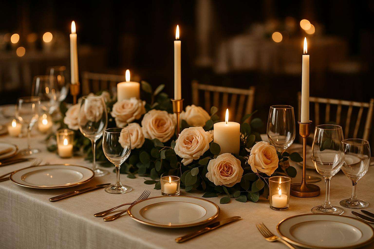
Blush + Ivory + Greenery
The most universally beautiful bridal palette of the modern era — proven across 20+ years of editorial
Blush, ivory, and greenery is the most consistently photographed, published, and praised bridal palette of the past two decades — and it deserves every accolade. The combination is rooted in one of the most natural visual pairings in existence: the pink-toned interior of a garden rose against its own deep green leaves and calyx, a color story that predates weddings entirely and will outlast any trend cycle. Its photographic durability is exceptional: the combination reads as romantic and warmly human in film, digital warm, digital cool, and flash; it brightens in midday sun and deepens beautifully in candlelight; it flatters virtually every skin tone by surrounding faces with warm, low-saturation color. In practice, the palette is built on garden roses and peonies (blush or soft pink) as the primary floral, eucalyptus in any variety as the primary greenery backbone (silver dollar, seeded, or willow), and ivory as the linen and attire anchor. The specific blush tone can shift from barely-pink to medium dusty rose without losing the combination's coherence. Blush taper candles, ivory pillar candles, and champagne or rose-gold metallics integrate naturally as accent elements. Stationery in this palette is beautifully handled by Minted's watercolor suite in blush and ivory, or by Rifle Paper Co.'s garden collections.
Strengths
- The most universally flattering bridal palette in photography — suitable for every skin tone, every venue type, every lighting condition, and every season; no other palette has a comparable track record of consistent beauty across all variables
- Garden roses and peonies, the primary florals for this palette, are widely available through most florists in a range of price points from accessible spray roses to premium garden roses, giving the palette genuine budget flexibility
- Translates seamlessly from ceremony to reception to portrait session without color fatigue — the inherent softness of the combination ensures it never overwhelms the visual frame
Weaknesses
- Its ubiquity in the 2015–2025 decade means some couples actively seek to differentiate from it — for couples who want a palette that reads as distinctive or unexpected in their editorial circle, this may feel too frequently seen; it is never wrong, but it is also never surprising
- Best for
- Any couple who prioritizes photographic beauty and wants a palette that will still feel romantic and current in their album in twenty years
- Pricing
- Accessible to luxury
Ivory + Champagne + Gold
The all-neutral palette — luminous, universally elegant, and the easiest to execute at every budget
The all-neutral palette of ivory, champagne, and gold is the most consistently elegant choice available to a wedding couple, and it earns that designation through both visual logic and practical versatility. The combination is, at its core, the palette of candlelight itself — the warm ochre of a flame, the cream of a wax pillar, the reflective glimmer of polished metal — which means it has been associated with celebration and romantic intimacy in the western visual tradition for centuries. In contemporary wedding design, it is executed through ivory or warm-white table linens (dupioni silk, raw silk, or high-quality cotton jacquard), white or cream florals with warm tones (garden roses, ranunculus, white anemones, champagne lisianthus, cream dahlias), and gold metallic accents throughout: gold pillar candleholder bases, gold charger plates, gold-rimmed champagne flutes, gold stationery foiling, and gold frame table numbers. The combination has no skin-tone conflicts and no venue conflicts — it is the single most universally appropriate palette across ballroom, garden, vineyard, estate, and modern industrial venues. The gold element can shift from bright yellow-gold to rose gold to antique bronze without losing the palette's coherence, allowing personalization within a proven framework. Martha Stewart Weddings has published this palette combination in some form in virtually every annual issue since 1998.
Strengths
- The most venue-agnostic palette on this list — ivory, champagne, and gold work in a hotel ballroom, an outdoor garden, a vineyard tent, a museum, and a modern loft with equal elegance; no other palette has this level of contextual flexibility
- White and cream flowers are the most universally available and affordable choice at most florists — the palette's aesthetic center of gravity does not require specialty or exotic blooms to execute beautifully
- The metallic element (gold) is available at every price point — $8 gold pillar candleholders from Target and $400 hand-hammered antique gold candelabras from specialty rentals both serve the same palette function
Weaknesses
- An all-neutral palette requires strong design architecture — without thoughtful variation in texture (silk vs. velvet vs. linen), scale (taper candles vs. pillar candles vs. wide-mouthed floral arrangements), and height, the combination can read as flat or undifferentiated; the palette is forgiving of color choices but unforgiving of poor spatial design
- Best for
- Couples who want a classic, utterly elegant, and universally beautiful palette — particularly for formal ballroom or estate weddings
- Pricing
- Accessible to luxury
Navy + White + Gold
The most enduring formal palette — classic American elegance with no expiration date
Navy, white, and gold is the most consistently formal and classically American of all the palettes on this list, and it carries the specific cultural weight of nautical tradition, Ivy League institution, and July Fourth celebration simultaneously — a combination of associations that gives it a particular resonance for certain couples while making it universally legible as elegant and celebratory. In wedding design, it is executed through navy and white floral combinations (white hydrangea, white roses, white ranunculus with deep navy delphinium or aconitum as the color accent), navy table linens paired with white floral arrangements or white linens with navy napkins, and gold metallic elements throughout (gold candleholders, gold flatware, gold-detail stationery). The combination photographs with excellent contrast in all lighting conditions — navy and white is one of the highest-contrast palette pairs available, which gives images a crisp, editorial quality that more muted palettes cannot replicate. It is specifically well-suited to coastal venues, country clubs, estate properties, and classically appointed ballrooms. The navy can range from true navy to slightly deeper midnight without losing the palette's identity. Vera Wang and J. Crew have both featured this palette combination extensively in wedding editorial, contributing to its strong current presence in aspirational bridal design.
Strengths
- Exceptional photographic contrast — navy and white creates one of the most naturally high-contrast palette pairings available, giving images a clean editorial crispness that distinguishes them from softer, more neutral combinations
- Deep cultural resonance with coastal, New England, and classically formal American wedding traditions — couples with ties to these contexts will find the palette both personally meaningful and visually coherent with their venue
- Genuinely four-season versatile — unlike strongly seasonal palettes, navy and white reads as crisp in summer and warm and rich in winter, so the choice does not lock you into a particular wedding date or month
Weaknesses
- Navy can feel heavy in certain venue contexts — specifically low-ceilinged or darker indoor spaces where it adds visual weight rather than contrast; this palette performs best in venues with significant natural light or high-wattage event lighting
- Best for
- Coastal weddings, country club receptions, estate properties, and couples drawn to crisp American formality
- Pricing
- Accessible to luxury
Burgundy + Ivory + Gold
The definitive fall palette — richly romantic, deeply saturated, and luminous in autumn light
Burgundy, ivory, and gold is the most complete expression of autumn in a wedding palette — the combination that fully inhabits the color story of October and November light, turning dried leaves, red wine, harvest fields, and candlelight into a coherent visual language for celebration. It is a palette with genuine emotional weight: the deep wine tone of burgundy communicates richness and depth, the ivory grounds it without competing, and the gold metallic reads as treasure rather than trend. In floral terms, it is executed through deep burgundy roses (Black Baccara, Dark Red Naomi, and Cherry Brandy are the most widely available varieties), deep burgundy calla lilies, dahlias in wine or aubergine tones, and marsala-toned anemones — all set against ivory linen and greenery in deep tones (dark eucalyptus, magnolia leaves, olive branch). Burgundy and ivory wedding cakes, burgundy bridesmaid dresses paired with ivory or champagne bridal attire, and deep wine menus with gold foil stationery all translate the palette consistently across every element. Monique Lhuillier's Fall 2023 bridal editorial featured this palette in three distinct interpretations, each photographically extraordinary. The combination is at its absolute best in venues with warm existing wood tones — barns, winery barrel rooms, dark-paneled estate dining rooms — where the palette is reinforced rather than contradicted by the environment.
Strengths
- The richest, most emotionally resonant palette on this list — burgundy and gold communicate celebration, abundance, and romance with a directness that softer, neutral palettes approach only in the most elevated executions
- Performs beautifully in autumn ambient light — the warm amber tones of October and November outdoor and window light make burgundy florals glow in a way they do not in other seasons; scheduling sunset portraits during this palette's optimal season is particularly rewarding
- Coordinates effortlessly with warm-wood and candlelit venues — barns, winery barrel rooms, and dark-paneled estate dining rooms reinforce rather than compete with the palette, so you spend less on transforming the space and more on the details that show
Weaknesses
- Strongly seasonal — this palette is categorically best in fall (September–November); it can feel incongruous in spring or summer weddings, particularly outdoor ones where natural greenery and light work against rather than with the deep, warm tones
- Best for
- Fall weddings, particularly those in estate, winery, barn, or historic manor venues with warm architectural tones
- Pricing
- Mid-range to luxury
All-White + Lush Greenery
The most architectural and editorial bridal palette — clean, modern, and visually extraordinary at scale
The all-white palette with lush greenery is the most boldly graphic of the timeless palettes — a combination that functions as much as design statement as color choice. At its most expansive, it is executed through massed white floral installations (white roses, white ranunculus, white anemones, white sweet peas, white larkspur) paired with deep, structural greenery (Italian ruscus, bay laurel, Boston fern, sword fern, monstera, fiddle-leaf fig branches) on white or ivory table linens, creating a visual that reads with both natural abundance and controlled precision. The palette is specifically well-suited to white or light-colored architectural venues — white tents, Mediteranean-style estates, modern urban lofts, and light-filled greenhouse spaces — where the environment reinforces the palette rather than introducing competing tones. In photography, it is the palette that editorial photographers most consistently call their favorite to shoot: high-key white, when handled expertly, creates a dreamlike luminosity, particularly in backlit outdoor settings. At a smaller scale, the all-white palette can be executed economically through grocery-store white roses, baby's breath massed as a design element, and eucalyptus garlands available from Costco and wholesale flower vendors — making it one of the few truly luxury-appearing palettes accessible at moderate budgets.
Strengths
- The most architecturally scalable palette — from a small table centerpiece to a 40-foot ceremony arch, the all-white and greenery combination scales consistently without proportional loss of visual quality
- A palette that actively improves with budget — there is a meaningful quality difference between $3,000 and $12,000 white floral executions, and each tier looks beautiful in its own right
- Approachable on a modest budget — massed baby's breath, grocery-store white roses, and bulk eucalyptus garland deliver a luxury-appearing result at a fraction of the cost of specialty blooms, making it one of the few high-end-looking palettes accessible to nearly any couple
Weaknesses
- Photographically unforgiving at the high-contrast end — all-white florals in direct harsh midday sun require skilled photography and careful exposure management to avoid blown-out highlights that reduce the detail in the arrangement; couples should discuss this with their photographer and plan portrait timing accordingly
- Best for
- Modern or minimalist venues, greenhouse and white-tent events, and couples with strong editorial vision who want a palette that scales dramatically with their floral budget
- Pricing
- Accessible to luxury
Sage + Ivory + Warm White
The most naturally organic palette — botanical, serene, and extraordinarily beautiful in outdoor light
Sage, ivory, and warm white is one of the most botanically honest of all the palettes here — it is essentially the palette of a herb garden or a Mediterranean hillside, expressed in wedding design. The combination communicates serenity, organic beauty, and a gentle, considered elegance that is distinct from the high-contrast formality of navy and white or the rich warmth of burgundy and gold. It is specifically well-suited to the growing category of garden, farm, vineyard, and outdoor-industrial venues where a more natural, plant-forward design aesthetic is expected. In floral terms, the palette is built on white garden roses and white ranunculus as the primary blooms, sage and eucalyptus as the dominant greenery, and accents of silver-dollar eucalyptus (which is itself a sage-toned botanical), dusty miller, and lamb's ear — all against natural linen or ivory table coverings. The palette works beautifully with all-natural materials in other design elements: naked (unfinished) wood table edges, terracotta potted herbs as table gifts, and handmade ceramic bud vases. Anthropologie's wedding shop and Rifle Paper Co.'s botanical stationery collections both build extensively on this palette, reflecting its strong resonance with a design-aware female audience.
Strengths
- The most naturalistic palette on the list — it genuinely photographs as though the wedding took place inside a working herb and cutting garden, giving images a quality of organic abundance and botanical richness that more formal palettes cannot replicate
- Pairs with the widest range of natural material accents — raw wood, handmade ceramic, undyed linen, terracotta — making it the ideal palette for eco-conscious couples or those working with sustainable materials
- Built largely on greenery and accessible white blooms, it is among the most affordable palettes to execute beautifully — eucalyptus, white garden roses, and dusty miller are stocked by nearly every florist, keeping costs down without sacrificing the lush, gathered look
Weaknesses
- Sage as a paint or textile color is prone to significant variation between manufacturers and dye lots — bridesmaid dresses ordered from different vendors in "sage" can arrive in visibly different tones; order all fabric elements from a single supplier and request fabric swatches before committing
- Best for
- Garden, greenhouse, farm, and outdoor venues; couples drawn to organic, botanical aesthetics; spring and early summer weddings
- Pricing
- Accessible to luxury
Dusty Blue + Silver + Ivory
The most quietly sophisticated palette — blue-grey botanical tones with winter-light luminosity
Dusty blue, silver, and ivory occupies a specific and beautiful niche: it is the most muted, tonally complex blue-based palette available, far removed from the bright primary of navy and much more botanically grounded than the clean American formality of royal blue. Dusty blue — the color of thistle blossoms, hydrangea in late summer, eucalyptus leaves, and frosted glass — has been a presence in luxury bridal editorial since at least 2010 and has maintained its editorial position without the sharp trend spike that temporary color moments experience. The palette is executed through blue hydrangea (which in late summer takes on dusty, greyed-blue tones), thistles, veronica, blue-toned muscari, and dusty miller (the foliage), all paired with silver metallic accents (silver candleholders, silver charger plates, silver-toned mercury glass votives) and ivory table linens. It is the most winter-appropriate of the non-jewel-tone palettes: the cool blue-grey spectrum reads beautifully against winter's lower-contrast ambient light and against the warm glow of candlelight, which provides the complementary contrast the palette needs. Vera Wang's Silver Series bridal gowns have been photographed in this palette combination in multiple editorial shoots.
Strengths
- The most winter-specific beautiful palette on the list — dusty blue and silver in candlelit ballroom settings creates a specific quality of cool luminosity that no other palette achieves, particularly in combination with the warm glow of candlelight providing complementary contrast
- Quietly distinctive without being trend-driven — dusty blue has held a steady presence in luxury bridal editorial since 2010 without the sharp spike-and-fade pattern of momentary color trends, so it reads as considered rather than of-the-moment
- The muted blue-grey range is exceptionally flattering across skin tones in formal portraiture — unlike a bright primary blue, the greyed tones recede softly behind faces, letting the couple and wedding party remain the focal point of every image
Weaknesses
- Blue florals — particularly blue hydrangea — are more seasonal and geographically variable than white, blush, or cream options; availability and quality can vary significantly by region and season, and the most beautiful dusty blue specimens (including some thistles and specialty ranunculus) may require special ordering
- Best for
- Winter and late fall weddings, formal ballroom and hotel venues, couples drawn to cool-toned, quietly sophisticated aesthetics
- Pricing
- Mid-range to luxury
Soft Pink + Cream + Rose Gold
The warmest, most celebratory feminine palette — luminous rose-gold accents elevate it above its category
Soft pink, cream, and rose gold is the most warmly celebratory of the neutral-adjacent palettes — and rose gold as a metallic specifically anchors it above the more obvious pairing of blush and silver. The combination of warm pink florals (blush peonies, soft pink spray roses, champagne lisianthus, blush ranunculus, and blush sweet peas) with cream linens and rose-gold metallic accents (rose-gold candleholders, rose-gold flatware, rose-gold stationery foiling, and rose-gold sequin or shimmer linen overlays) creates an environment of concentrated, gathered warmth — a palette that is clearly about celebration. In photography, rose gold reflects a specific quality of warm light that photographs distinctively against skin tones, creating a luminosity in portrait work that brighter or cooler metallics do not produce. The palette is available at a range of price points: blush spray roses and cream stock flowers are accessible wholesale offerings, and rose-gold metallic elements are available through retailers including Amazon, Paper Source, and specialty event rental companies. Rifle Paper Co.'s rose gold stationery collections pair beautifully with this palette, and Anthropologie's bridesmaids range regularly features blush and cream options that function as a ready-made attire system for this combination.
Strengths
- Rose gold as the metallic accent reads as distinctive rather than expected — while gold and silver are both ubiquitous wedding choices, rose gold occupies a specific warm-feminine register that gives the palette a personality all its own
- Built on the most accessible florals in the wedding world — blush spray roses, soft pink stock, and champagne lisianthus are wholesale staples available nearly year-round, so the palette delivers a polished, celebratory look at an approachable floral budget
- Rose gold reflects a warm quality of light that photographs distinctively against skin tones, lending portrait work a soft luminosity that cooler metallics like silver simply cannot reproduce
Weaknesses
- Rose gold as a trend had a significant peak in 2015–2020 that some couples now associate with a specific cultural moment; for couples concerned about the palette reading as dated, the warm gold range (amber gold, antique gold, bronze) can substitute as a slightly more neutral metallic without losing the warm-toned character of the combination
- Best for
- Hotel ballrooms and greenhouse venues; spring and early summer weddings; couples drawn to warmth and femininity
- Pricing
- Accessible to luxury
Forest Green + Ivory + Bronze
The deepest, most richly textured of the botanical palettes — earthy, grounded, and deeply romantic
Forest green, ivory, and bronze is the most richly earthy of the palettes on this list — and it is the one that most frequently photographs as genuinely extraordinary in the right venue with the right lighting. The combination builds on deep hunter green foliage (Italian ruscus, bay laurel, magnolia leaves, boxwood, dark eucalyptus) as the dominant visual element, with ivory florals (white anemones, white ranunculus, cream dahlias, ivory sweet peas) as the bloom accent, and bronze or antique copper metallic elements (bronze candlestick holders, antique copper lanterns, bronze-toned mercury votives, bronze-framed geometric terrariums) as the warm contrast accent. The palette is specifically designed around the prevalence of green rather than the bloom — the florals are restrained and pure, allowing the richness and textural variety of the greenery to dominate. This approach can significantly reduce floral costs compared to bloom-heavy palettes, since foliage is considerably less expensive than specialty florals. In venue terms, it is best suited to barn, estate, outdoor manor, and forest-adjacent venues where the dark greens read as extensions of the natural environment rather than impositions. Anthropologie's Terrain garden wedding aesthetic has built extensively on this color story.
Strengths
- The green-dominant approach significantly reduces floral costs — foliage is substantially less expensive per stem than specialty blooms, and the lush, botanical aesthetic of this palette is driven by the foliage rather than the flowers
- The palette reads as genuinely nature-rooted and place-specific in forest, estate, and barn venues — a quality that couples with strong connections to land and natural environments often find deeply personally resonant
- Deep hunter green is one of the most enduring of all wedding tones — it has appeared continuously in formal design for generations and shows no sign of dating, so an album built on this palette will read as classic rather than tied to any single era
Weaknesses
- Forest green can read as dark and heavy in venues with low lighting or small windows — this palette requires either a naturally light-filled venue or a significant candle and event-lighting investment to avoid feeling dim rather than romantic
- Best for
- Barn, estate, outdoor manor, and forest venues; fall and late summer weddings; couples drawn to botanical, earthy aesthetics
- Pricing
- Mid-range to luxury
Black + White + Verdant Green
The most dramatically editorial palette — maximum contrast, graphic beauty, and bold romantic intent
Black, white, and verdant green is the most cinematically bold of the timeless palettes — and it is specifically for couples who want their wedding photography to look like a magazine editorial rather than a traditional wedding album. The combination operates on pure contrast: white tablecloths with black napkins, or black tablecloths with white napkins; large tropical foliage in deep emerald green (fiddle-leaf figs, monstera leaves, king palm fronds, philodendron, tropical ti leaves) as the dominant architectural floral element; white blooms (anthuriums, birds of paradise in white, white orchid spikes, white calla lilies) as the accent; and black geometric metallic details (black wire candleholders, black iron lanterns, black-framed acrylic table numbers). The palette is specifically well-suited to modern urban venues: rooftop event spaces, contemporary art galleries, industrial lofts, and mid-century modern estates where architectural lines support rather than conflict with the graphic quality of the palette. It photographs with exceptional sharpness and editorial contrast across all camera systems, and it is one of the few palettes that actually benefits from flash photography rather than suffering from it — the contrast is enhanced, not reduced, by direct flash. The specific quality of "dramatic" here is not aggressive — it is architectural and intentional, which is why the palette reads as timelessly modern rather than momentarily edgy.
Strengths
- The most photographically distinctive palette on this list for editorial-minded couples — the contrast ratio of black and white with tropical green creates images that have an immediate graphic impact and an arresting visual quality that softer palettes cannot produce
- One of the few palettes that benefits from flash photography rather than suffering from it — direct flash deepens the black-and-white contrast instead of flattening it, which is a genuine advantage for evening receptions and dance-floor coverage
- Built on architecture and contrast rather than on a trend color, it reads as timelessly modern rather than momentarily edgy — black, white, and green are permanent design fixtures, so the look will feel as current in 2046 as it does today
Weaknesses
- Large tropical foliage — fiddle-leaf figs, monstera, king palm fronds — requires specialist sourcing and careful transport logistics; not all florists have established wholesale relationships with tropical foliage suppliers, and prices vary significantly by geography; confirm foliage sourcing with your florist before committing to this palette
- Best for
- Modern urban venues, art galleries, rooftop events, and couples with strong editorial vision who want maximum visual impact
- Pricing
- Mid-range to luxury
Frequently asked
How do I choose a wedding color palette that will still look beautiful in photos in 15 years?
The single most reliable indicator of a palette's longevity is whether it is built on natural precedent — combinations that exist in nature (rose gardens, herb fields, autumn forests, Mediterranean coastlines) rather than trend boards are inherently more durable. Test your palette choice by looking at wedding photos from 10–15 years ago: palettes featuring ivory, champagne, and gold; blush and greenery; all-white with lush foliage; and navy and white all look current today in ways that the trend-driven palettes of each era do not. Also: evaluate your palette in the specific lighting conditions your venue will provide. A palette that looks beautiful in showroom lighting may read completely differently in your barn venue at 7pm in October.
How many colors should a wedding color palette include?
The most reliable wedding color palettes include three to four tones: one dominant tone (usually a neutral anchor like ivory, cream, or white), one primary accent color (blush, navy, sage, burgundy), and one to two metallic or textural accents (gold, silver, rose gold, bronze). More than four distinct tones tends to create visual competition rather than coherence; fewer than three can read as flat or undifferentiated. The specific rule of thumb from most florists and event designers: choose your primary bloom color first, then select your neutral anchor, then identify the metallic element that best complements the two — and stop there.
Do I need to choose different wedding colors for different seasons?
No — but you should choose colors that work with your season's ambient light rather than against it. The ten palettes on this list are all genuinely cross-seasonal, but each has a specific season where it performs at its absolute best: blush and greenery in spring, all-white with greenery in summer, burgundy and gold in fall, and dusty blue and silver in winter. If your palette and your season are in harmony, your photographer will thank you — the ambient light reinforces rather than contradicts the tones you have chosen, and the entire visual environment of the day feels coherent in a way that cross-grain choices rarely achieve.
How do I translate a wedding color palette from florals to stationery to attire?
Start with the florals, since floral color is the most constrained by availability and the most central to the visual record of the day. Once you have confirmed your floral palette with your florist (using actual samples, not online images — color rendering varies widely between screens), use those physical samples to match stationery and textile colors. Bring floral samples to your bridesmaid dress appointment and to your stationery consultation; do not rely on digital color matching. For stationery, Minted and Rifle Paper Co. both offer custom color-matching services. The attire anchor (ivory or white) should be confirmed with your dress before finalizing linen choices, since different whites and creams interact very differently with one another and with floral tones.
What is the most versatile wedding color palette for a venue I haven't chosen yet?
Ivory, champagne, and gold is the most universally venue-neutral palette on this list — it works in a hotel ballroom, vineyard tent, outdoor garden, museum, and modern loft with equal elegance because it creates its own warm, candlelit environment rather than relying on or competing with the venue's existing color context. If you are locking in your palette before your venue, this combination gives you the most freedom to subsequently choose almost any venue without conflict. The second most versatile choice is all-white with lush greenery, which works across the widest range of venue architecture — the white-on-white approach reads as a design statement in modern spaces and as classic elegance in traditional ones.
Are there any wedding color palette trends I should actively avoid for longevity?
Any palette built primarily on a trend-specific Pantone color of the year or a social media color moment is at higher risk of dating within five years. Terracotta and rust (dominant 2021–2022), millennial mauve (dominant 2018–2020), and ultra-violet palettes (2018 Pantone color) are all examples of combinations that still photograph beautifully but now carry immediate temporal association with their moment. The underlying principle: palettes grounded in neutral anchors (ivory, cream, warm white) with one natural-world accent color are virtually always safer choices for longevity than those built around two strong chromatic tones in conversation with each other. That said — if you love terracotta, the right choice is to love it freely; no color choice is objectively wrong for a wedding.